zoom agenda

zoom agenda

zoom agenda

PRODUCTIVITY FEATURE AIMING TO SOLVE THE "THIS COULD'VE BEEN AN EMAIL" EPIDEMIC

PRODUCTIVITY FEATURE AIMING TO SOLVE THE "THIS COULD'VE BEEN AN EMAIL" EPIDEMIC

0/overview

0/overview

0/overview

Zoom hit a massive popularity spike in 2020 due to the COVID-19 pandemic. Social distancing protocols and remote working created a need for a reliable, widely accessible virtual meeting space and Zoom quickly became that space.

problem

problem

problem

Virtual meetings are a drag. They often go over time, become tangential, and are known to cause fatigue.

1/research

1/research

1/research

Most of the competitor video conferencing platforms were relatively standard. I saw huge opportunities in a newer player in the space, Butter. Butter felt fresh, experimental, and utilized a ton of additional native features to make the online meeting experience more engaging.

6 participants

ages 22-50

user interviews

user interviews

user interviews

  1. What role does productivity plays in people’s lives?

  2. How does meeting with others correlate to increased productivity?

  3. How do virtual meetings compare to in-person meetings?

  4. What is the step-by-step process of preparing for and attending a meeting?

  5. How do participants share and communicate with others during meetings?

  6. What are paint points for participants when meeting virtually?

  7. What role does agenda-setting play in productivity-related meetings?

findings

findings

findings

  1. Oftentimes "organized meetings" are far from organized with no clear agenda or purpose

  2. If there is an agenda typically it's shown at the beginning of the meeting and often disregarded

  3. Zoom meetings typically bolster low participant engagement and restrict participants from speaking up during meetings

It’s one thing to have a roadmap in your head, but it’s a whole other thing when you have to frame it for other people.

It’s normally welcome screen, name of the meeting, and then boom agenda, and that’s the last time you see it.... it kind of felt like an empty promise.

2/define

2/define

2/define

The research displayed a “cause and effect” between facilitators hosting disorganized meetings and participants not engaging during disorganized meetings. In order to create a more user-centric experience for both groups it helped to contextualize the primary audiences and level set their expectations and current pains.

crazy eights

crazy eights

crazy eights

Crazy Eights is an rapid fire brainstorming exercise to get the creative juices flowing in the early stages of the design cycle. I had eight minutes to create eight concepts to help me step out of the expectation that every idea I had must be immediately perfect.

feature flow

feature flow

feature flow

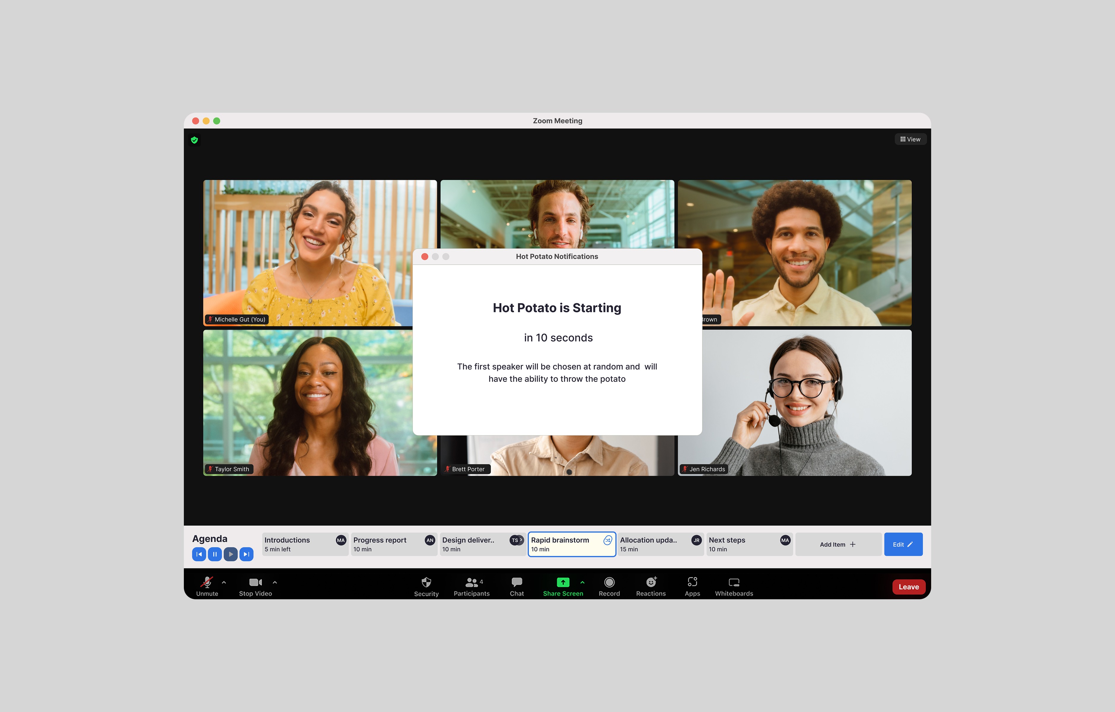
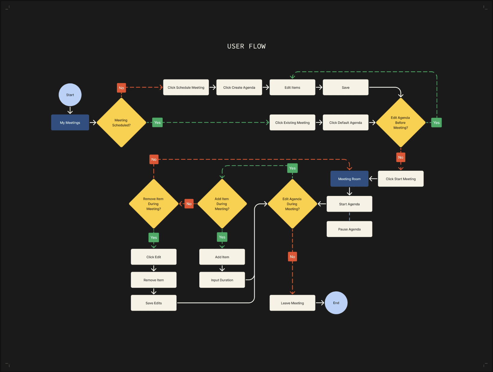
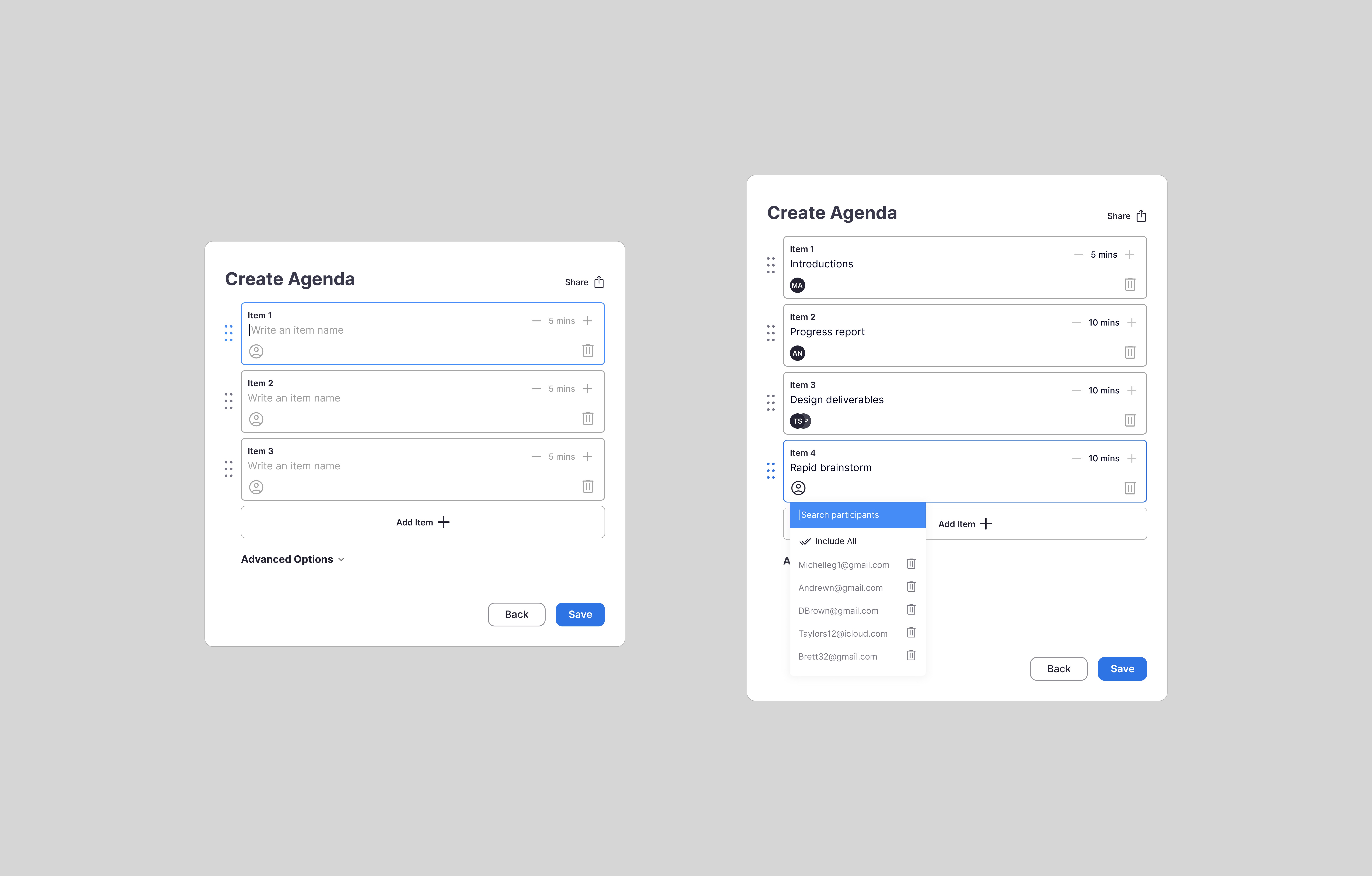
With the primary audience being busy, working professionals I aimed to make the flow as intuitive as possible with Zoom’s current flow so users wouldn’t have to waste time trying to learn an entirely new tool and could get to their meeting in minutes.

3/design

3/design

3/design

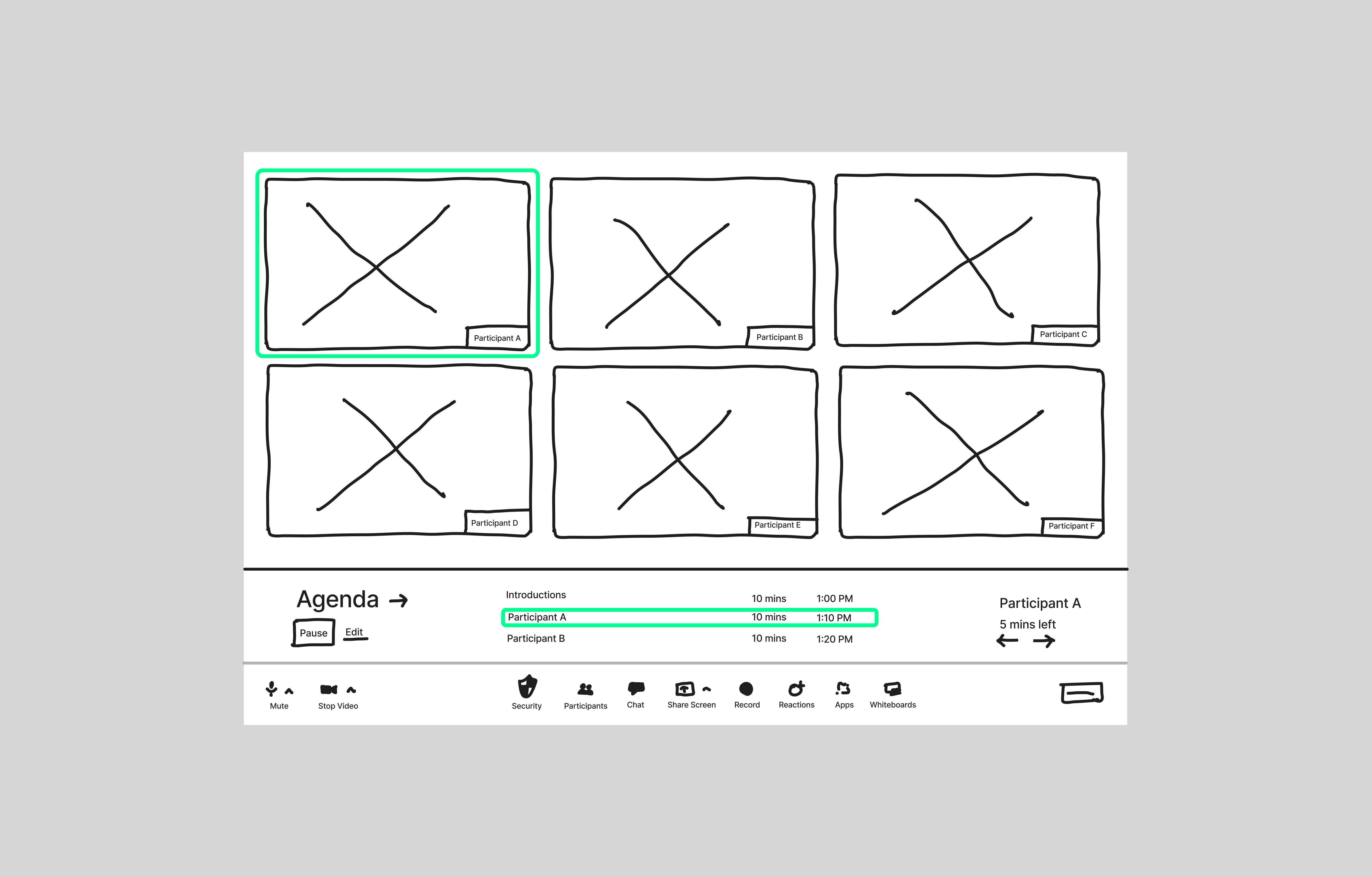
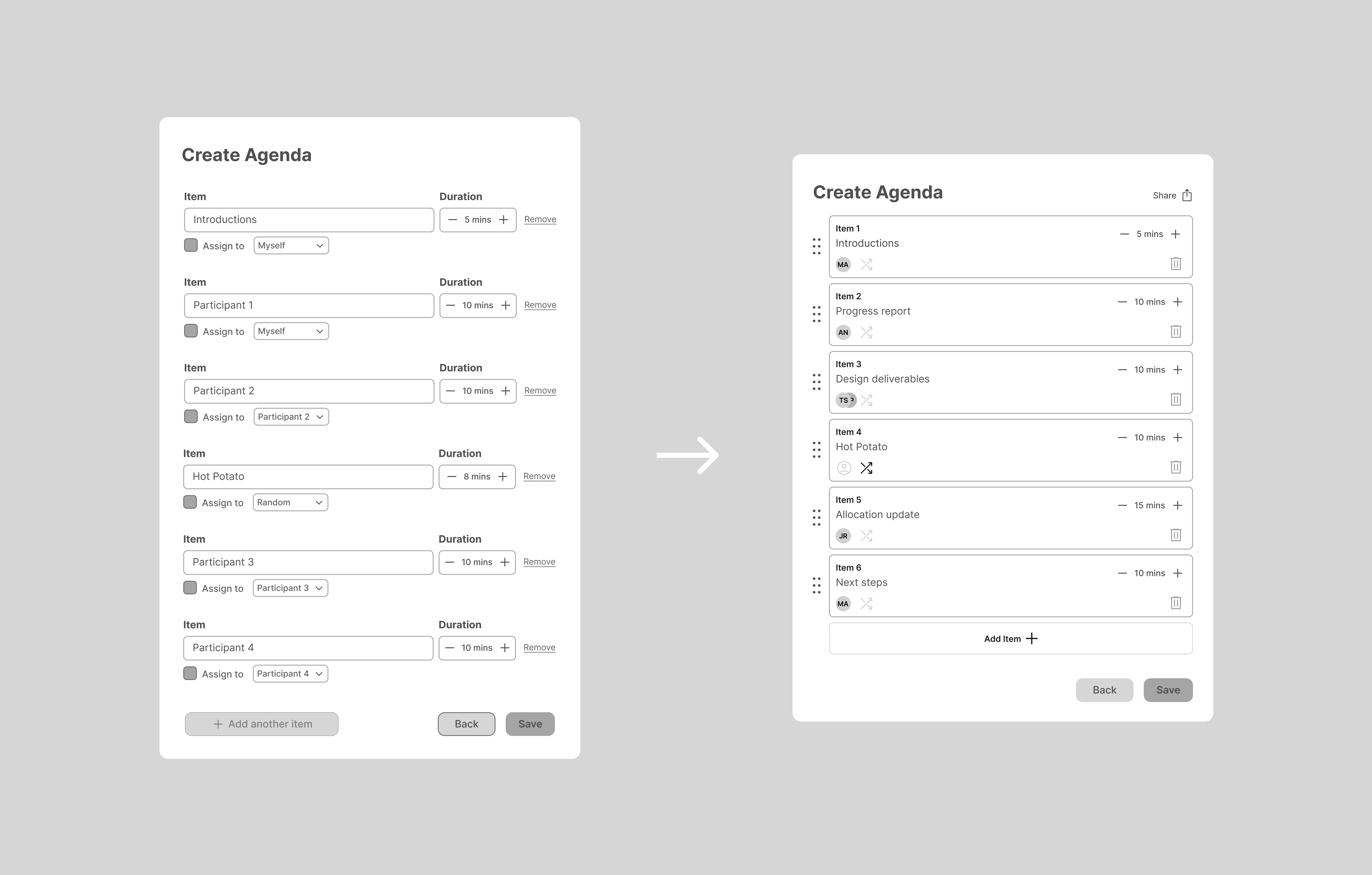
The more significant iterations occurred between the early ideation sketch stage to the wireframe stage. After defining key tasks within the feature I began to dive deeper into eliminating unnecessary steps for users to complete those tasks. I also wanted to ensure the platform wouldn’t distract users from the content of the meeting, but rather give them the agency to engage more.

4/test

4/test

4/test

5 participants

ages 21-59

usability testing

usability testing

usability testing

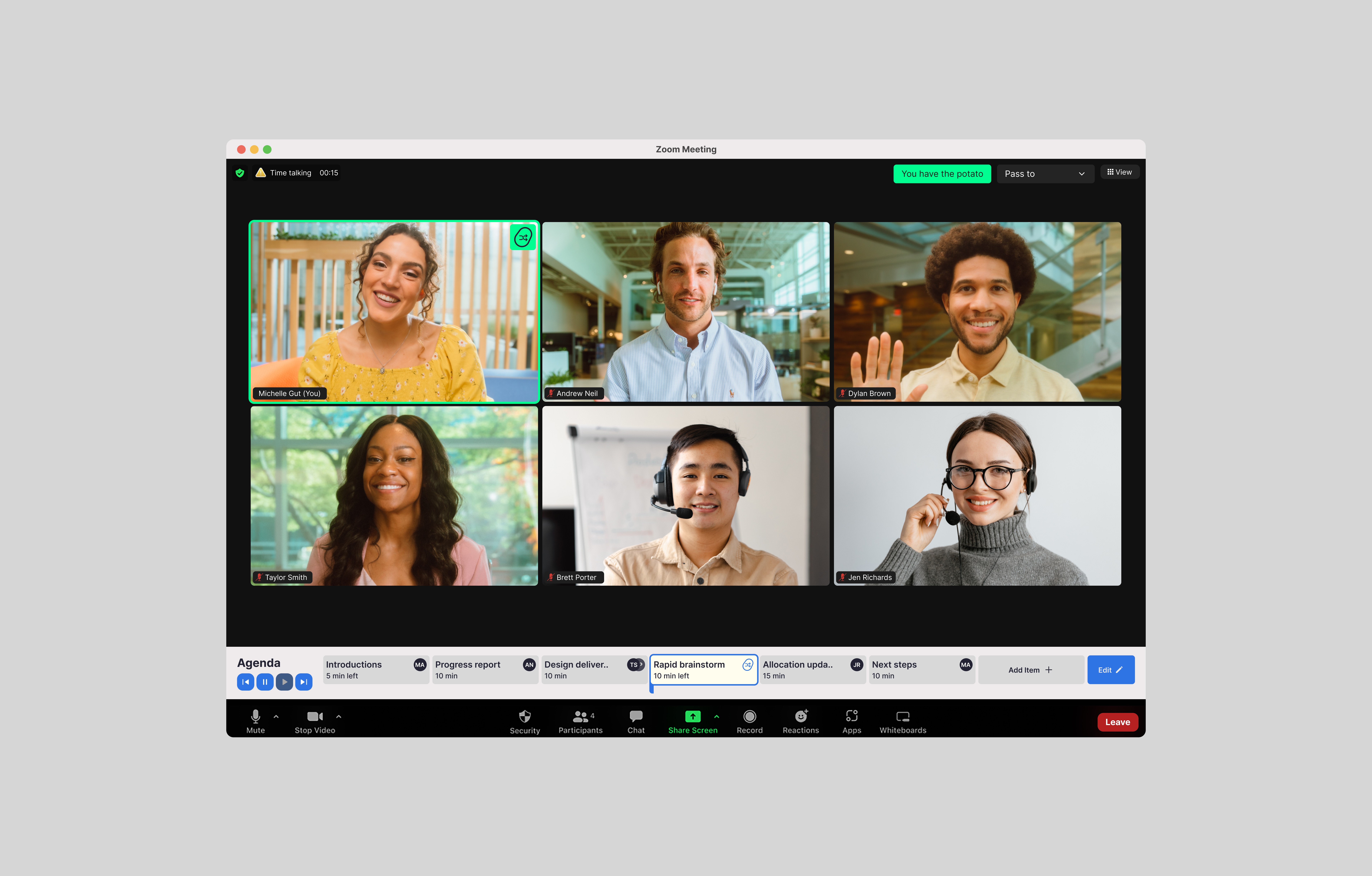
The high-fidelity wireframes allowed me to create a more accurate product prototype where I could conduct usability tests with participants and identify what was working well and what could be improved. I measured success on participants ability to complete the following tasks:


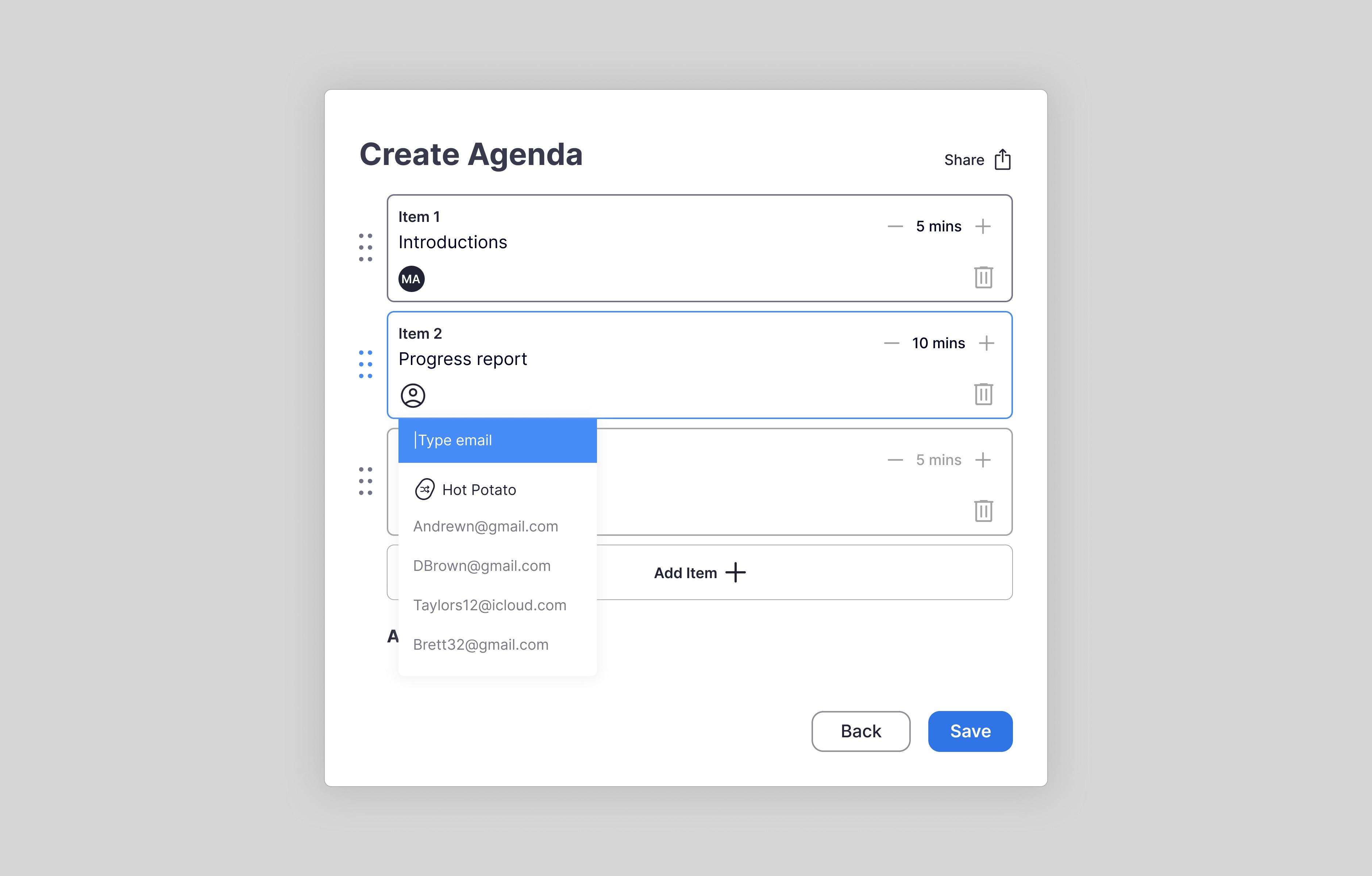
1. Create agenda

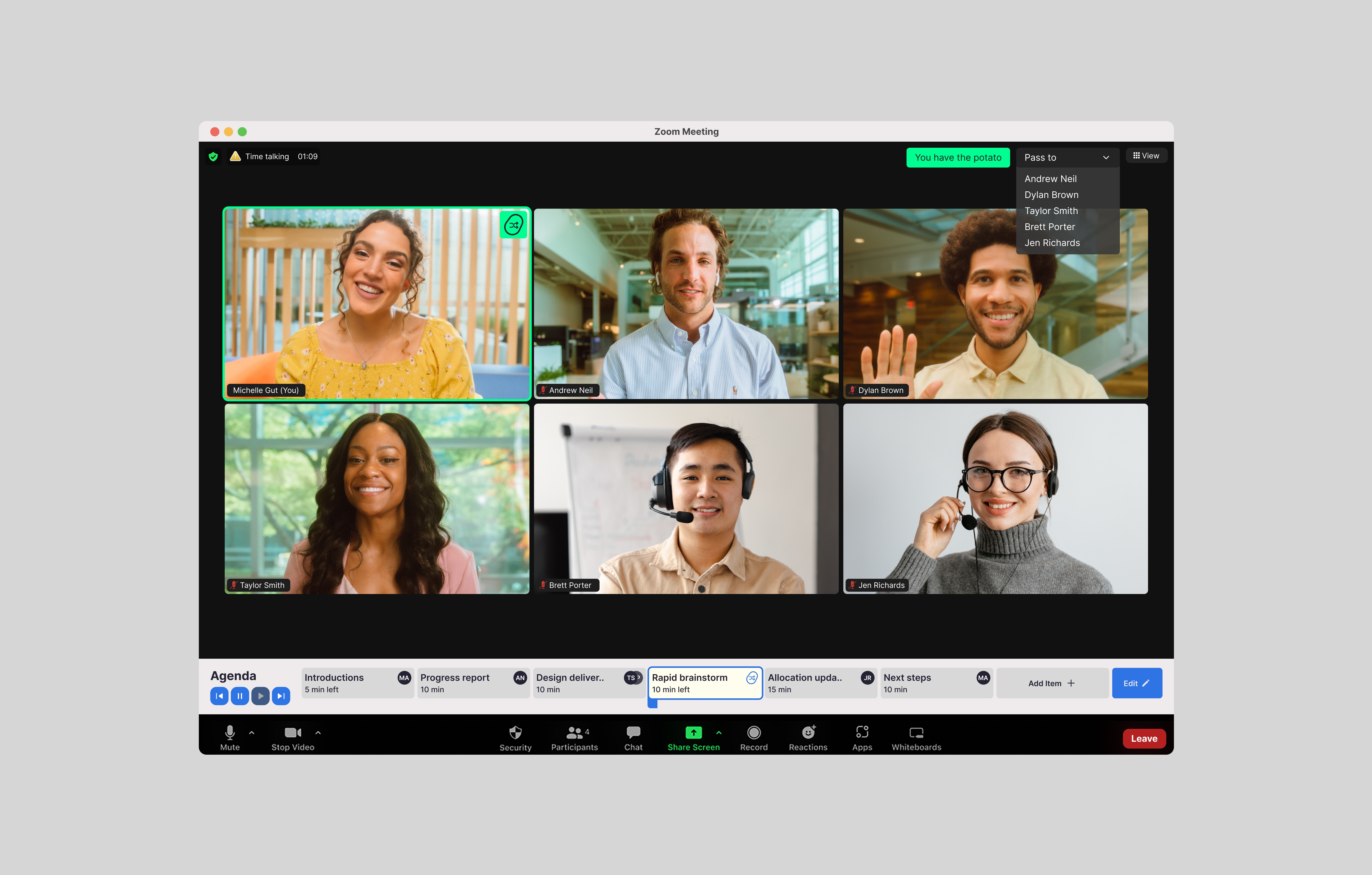
2. Pass the hot potato

3. Add and remove an agenda item during a meeting

4. Navigating participant view

results

results

results

Although the prototype passed based on the success metrics in place, I received insightful feedback from usability participants that encouraged me to implement some changes.


  1. HOT POTATO FEATURE

    Participants were confused by the “random” option and didn’t understand how you could create a hot potato session. I decided to establish this feature more and include a way for certain people to be left out of the hot potato “circle” which another participant recommended.


  1. ADVANCED AGENDA OPTIONS

    A few participants asked who be navigating through the agenda items. They felt like it may be a good idea to have an automatic option so the facilitator doesn’t have to click through each item. This also provided a way for facilitators to give or remove participant control of the agenda.

5/FINAL CONCEPT

5/FINAL CONCEPT

5/FINAL CONCEPT

Ultimately, I wanted to create a dating app that broke the “dating app formula” we’re so used to seeing.


A majority of us carry around micro-computers in our back pockets nearly everywhere we go, yet we’re more isolated than ever before. Is there a way we can utilize tech to help us start actually connecting again?

6/REFLECT

6/REFLECT

6/REFLECT

Overall this project challenged me to think outside the box and consider healthier ways for people to interact with dating apps. I see a ton of room for growth and expansion within this app. I believe that post-pandemic, people are craving human connection now more than ever. The app’s connection to real-world events could spawn partnerships/sponsorships with bars, college campuses, festivals, and different venues nationwide.


If I had more time I’d like to:

  1. Design more error states and different paths

  2. Partner with a developer to create a beta version of the app with more accurate animations and functionality

working remotely from boston, ma

working remotely from boston, ma